A mobile app that helps students and young professionals stay on time by reframing how they experience and track time.
Overview
Designed a mobile-first time management tool focused on reducing lateness and improving punctuality through behavior-aware interaction design.
Context
Role
Designer
Duration
1 month
Skills
Figma, Prototyping, UX/UI, Brand Design
Collaborators
None (Independent project)
Problem
Many college students and young working adults struggle with time management and punctuality while balancing demanding schedules. Busy mornings, distractions, and underestimating task duration lead to chronic lateness and stress.
How might we help users better anticipate and navigate time in a way that aligns with how they actually behave?
Research/Key Findings
I conducted semi-structured interviews with 15 students and young professionals to better understand how people manage their time in daily life.
The goal was to uncover:
- how users plan vs. actually act
- where breakdowns occur in task completion
- how existing tools (calendars, reminders, notes) fit into their routines
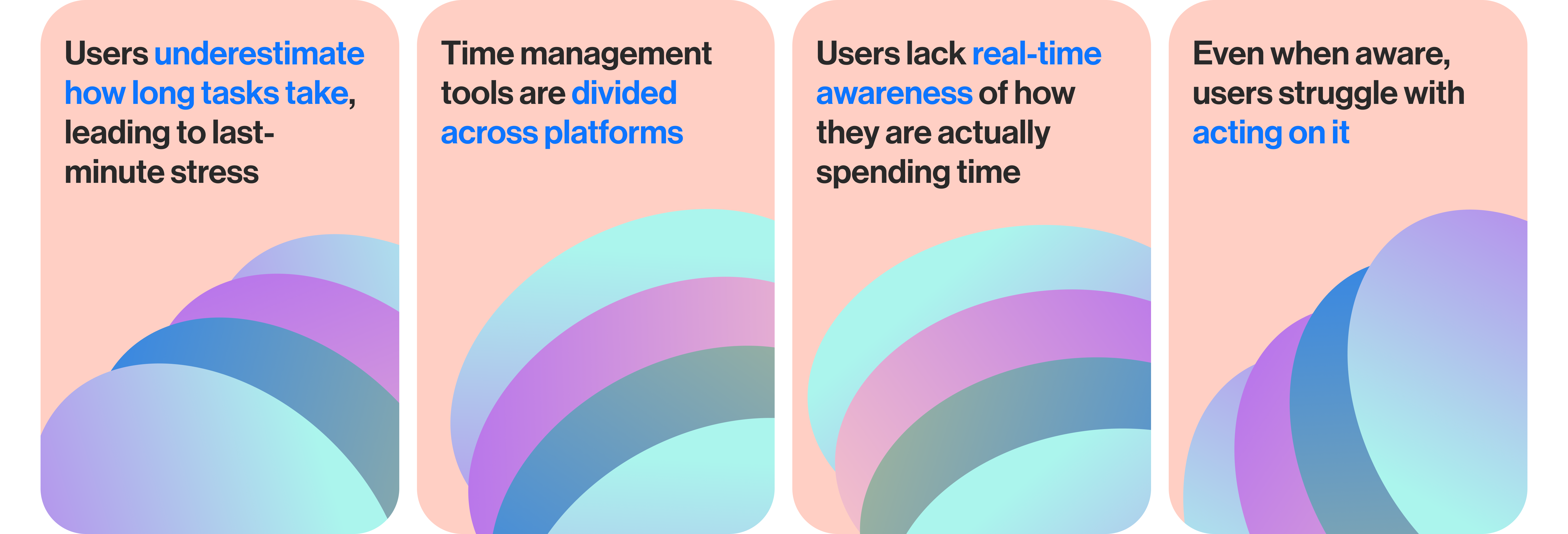
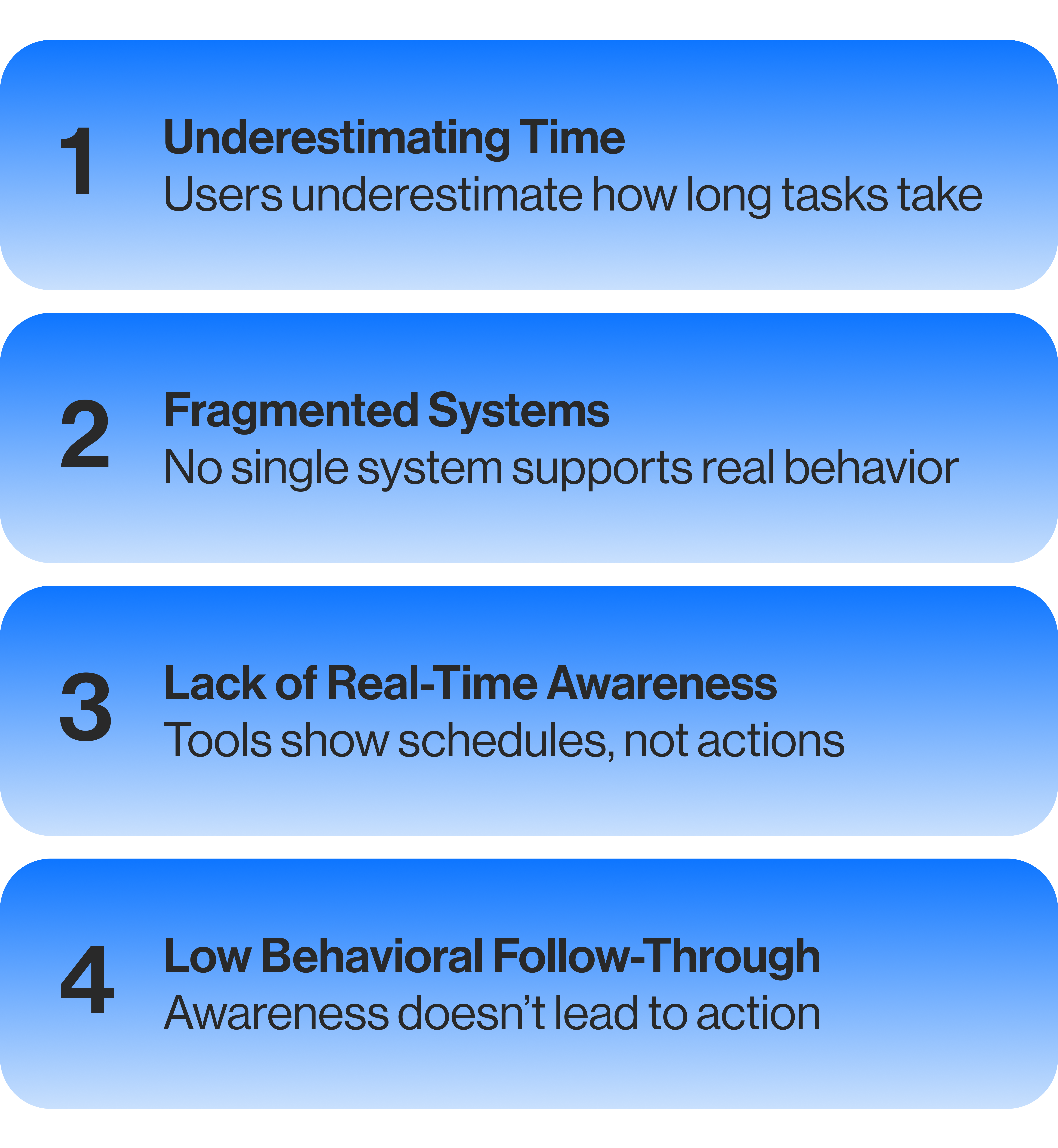
What I Observed
Across 15 interviews, consistent behavioral patterns emerged around how users plan, act, and respond to time-based tasks.
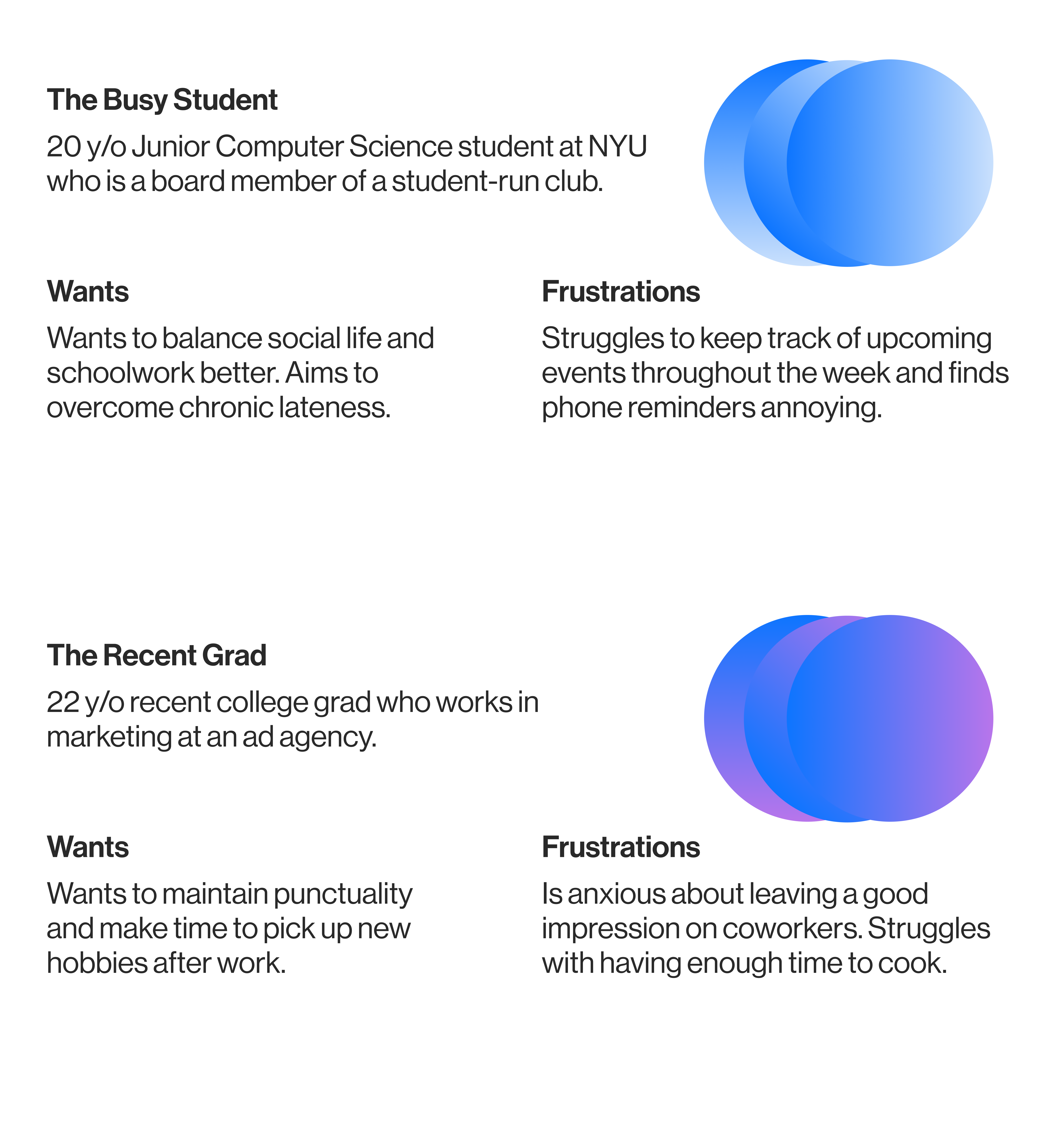
Personas
These personas reflect how the same behavioral patterns manifest across different lifestyles.
Core Insight
Users don’t struggle because they lack tools; they struggle because those tools don’t align with how they actually behave in real time.
While users are aware of their habits, existing systems rely on planning and reminders rather than guiding action in the moment.
This creates a gap between intention and follow-through.
Design Strategy
Based on these insights, the design shifted away from static planning tools and toward real-time guidance.
The product should therefore focus on:
- helping users act in the moment, not just plan ahead
- visualizing time as something dynamic and ongoing
- introducing subtle urgency to support follow-through
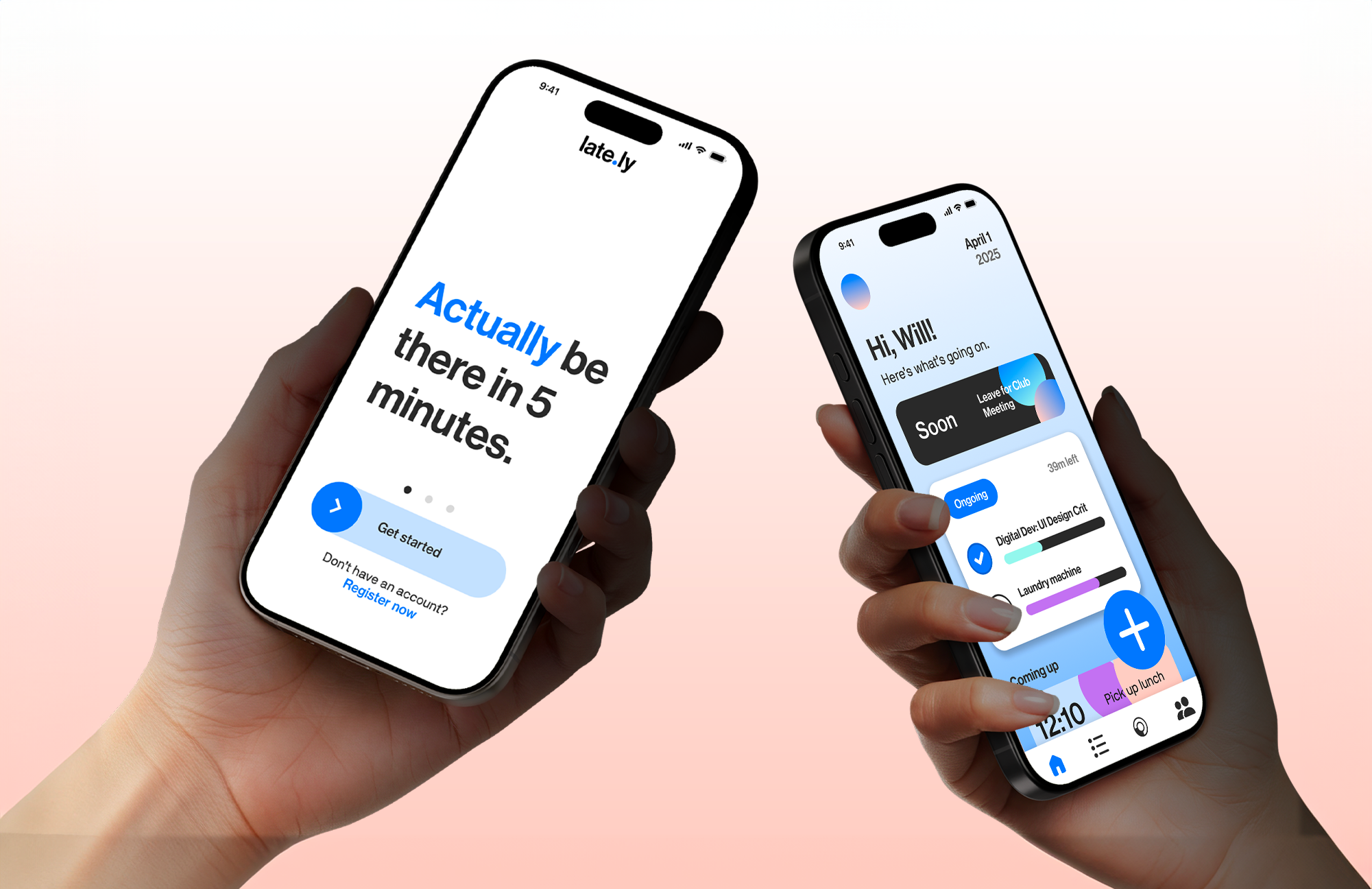
Onboarding
Introduces users to a more active relationship with time, setting expectations that the app supports real-time action rather than passive planning.
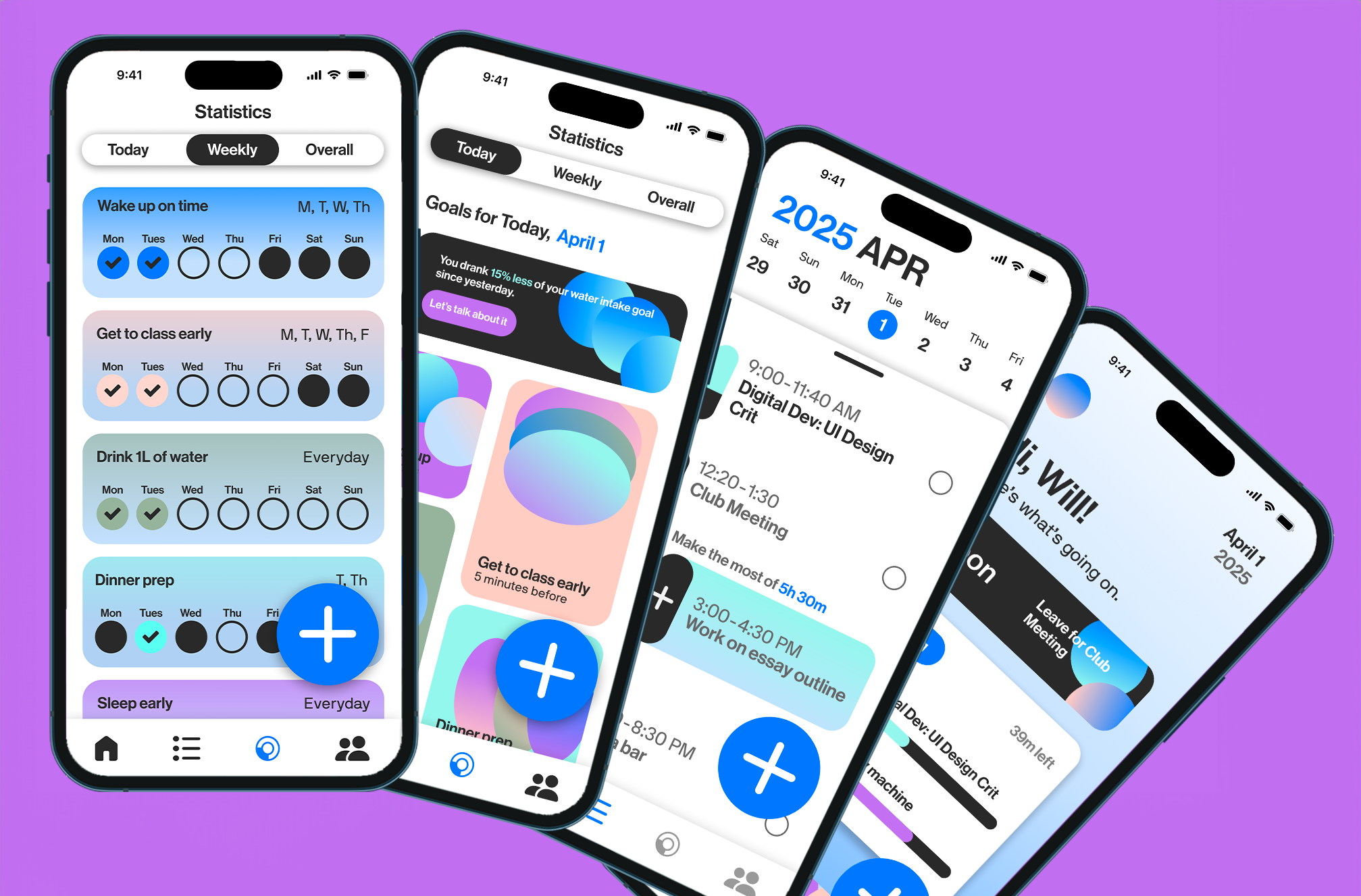
Home
Surfaces what the user should be doing right now, helping bridge the gap between intention and action through immediate, time-based guidance.
Calendar
Reframes scheduling by incorporating task duration and transition time, allowing users to better anticipate how long things actually take.
Statistics
Visualizes patterns in behavior over time, reinforcing awareness while connecting it to actionable insights.
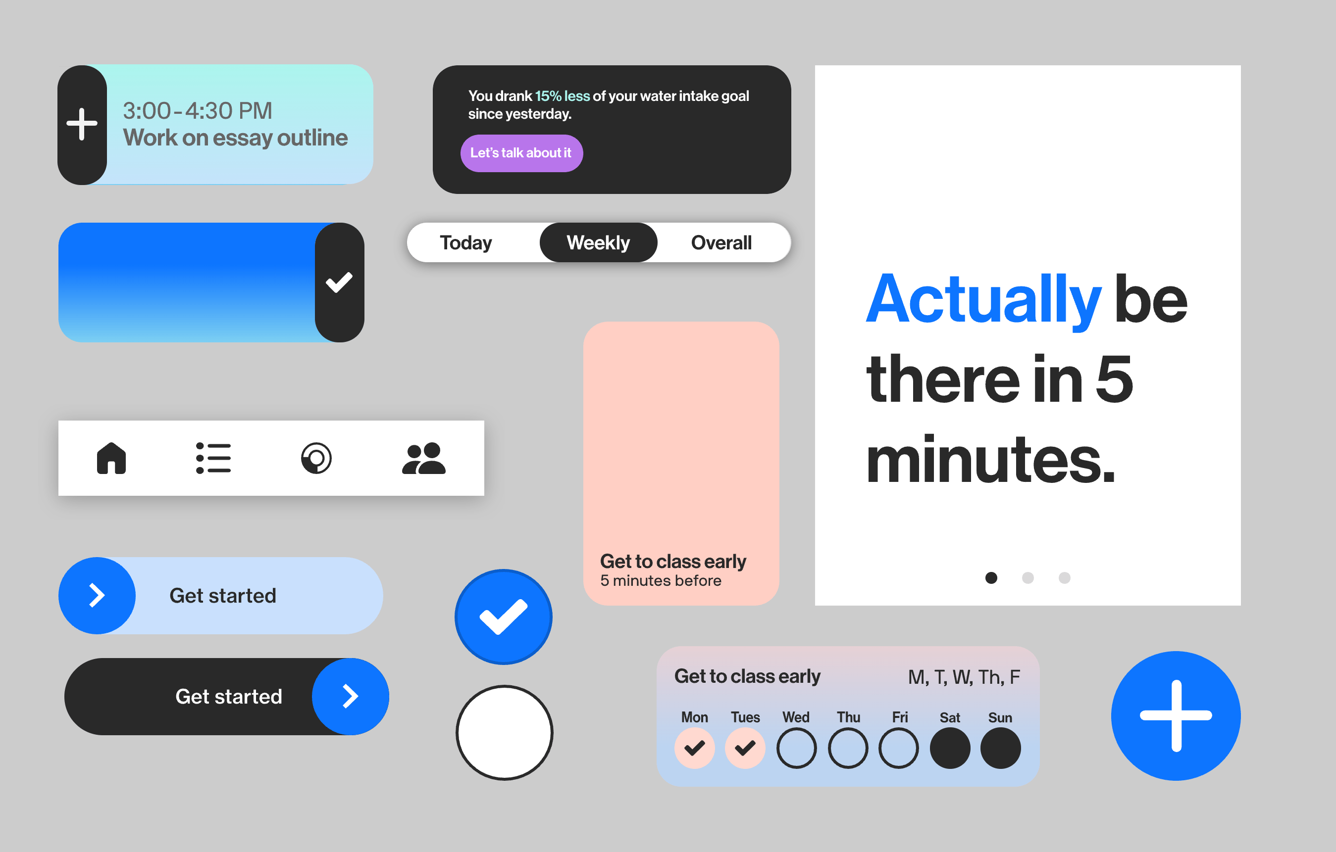
Identity and Visual Language
The visual system was designed to make time feel active rather than static.
Instead of neutral, calendar-like interfaces, late.ly uses color, motion, and contrast to signal urgency and guide attention in real time.
Bright gradients and shifting visual states reflect the ongoing nature of time, while high-contrast elements highlight what requires immediate action.
Reflection
Given more time, I would explore notification systems and microinteractions as behavioral nudges—testing how timing, tone, and frequency can encourage action without creating fatigue.
I would also expand the system to include more contextual features, such as adaptive reminders or community-based accountability, to better support long-term behavior change.
This project ultimately shifted my approach to time-based design, from organizing schedules to designing for action.